Posts

Studio 5 - Interiors 2 Continued

Image
After the workshop I created a second response to the brief from photos I had taken of different viewpoints, looking down at the atrium from the first floor. The second response was a look into how people move and interact with the space around them. I sat on the first floor of the building looking down over the atrium, mapping out the paths and movements of the people below. One thing I noticed is how the majority of people from the angle I was sat, began from a certain point and all spread out on completely different paths. The resulted mapping of this reminds me of the tree of life and makes me think how varied people’s paths of life can become after all beginning from the same singular point of birth. 

Studio 6 - Observational Drawing

Image
For the sixth and final studio workshop, we took the workshop outside to make the most of the delightful weather. The brief was to go to three different locations and create observational drawings of the location. The first location I went to was the Huddersfield indoor market; to see how the people interacted with the space and the hustle and bustle of the market scene. The element of the market I chose mainly to focus on was the architecture of the building and the objects surrounding me, as you can see from the beam and boxes illustrations below. The second location I went to was a shopping area located by the library and art gallery; my observational drawings from the location are of the library/art gallery building and the chaotic trees that stand beside it. The third location was the Gothic Quarter of Huddersfield, by the side of the church. I chose to look at the intricate details at the top of the buildings, above the bars and shop fronts. I also chose to d...

Typography 4

Image
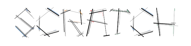
Following on from the three typography workshops where three draft fonts were created, one was taken forwards to create a more finished font. I have decided to go back to my second favourite of them and refine it more on illustrator. I have taken the rough drawing of the font, recreated it with neater lines, edited some of the letters to read more clearly and added additional details and elements of colour to the font. When deciding to name the font, after creating the full alphabet, it was reminding me of cavemen and the cave drawings they have created that have been etched into the walls of the cave. The names were narrowed down to Caveman, Etching, Engrave and Scratch. The chosen name for my font is Scratch. When the font is displayed on a black background, it highlights the coloured elements of the font. And shows a unique font of sorts made up of lines and dots; a coded font.

Editorial Design - The Document

Image
In the sixth and final Editorial Design workshop, we covered a few different techniques in Illustrator and InDesign. In the first half of the workshop we familiarised ourselves with adobe capture and how to use it to take photos of vectors, make patterns and colour palettes. We then linked this to illustrator to use the images we had just taken. We then progressed to taking a photo from Pexels.com which we edited, rendered and clipped, then adding text to achieve the result shown below. After that we moved onto the InDesign portion of the workshop where we created a mini portfolio of work taken from previous blog posts and workshops. We then learnt of how to export and package the file, leaving us with multiple copies both online and stored to a device; to always have access to our work. The mini portfolio I created is shown below and accessible from https://indd.adobe.com/view/95483216-951e-4577-aad4-e4395029339f

After Effects 6 - Space Task

In the sixth After Effects workshop, the task was to create a 10 second animation of something that you would find in space. This was then to be edited together with all the other animations from my group to create one 3-4 minute animation of numerous different things in space. I decided to create my animation based on Halley’s comet, a comet that is visible from earth only once every 74-79 years. Also included in my animation is a rotating planet, after learning how to create the only 3D shape you can create in After Effects, a sphere. The workshop also taught us the use of the alpha channel in After Effects when rendering animations, as the animation includes transparency at the start and the end so they could be easily edited together. Below is my 10 second animation of Halley’ Comet, followed by the final result of Group C. Halley's Comet from Eve Whelan on Vimeo . Year 1 Finale: Group C from Motion-go on Vimeo .

Studio 5 - Interiors 2

Image
The task for this workshop was to look around the creative arts building and it’s different levels, exploring the way people move and interact with the space around them, how perspective can create such unique and innovative composition and how windows act as frames to the world. The first piece I created below as a response was an oil pastel piece looking at unusual perspectives and how compose a piece from it. I am pleased with the result and the tonal work created with the oil pastels despite being a medium I rarely use.

Cinema 4D - The Object

Image
In the first Cinema 4D workshop we learnt the basics of how to add and manipulate some objects and text. The task was then to create a short 90 frame animation using an emitter and programming the objects it emits I am pleased with managing to produce this in a fairly short space of time as this was my first time using Cinema 4D and I knew nothing about how the software worked. It is something I found interesting and would like to delve more into the software and how to use it . Below is my short animation and a few screenshots from it. C4D - Colour from Eve Whelan on Vimeo .

After Effects 5 - Kinetic Typography 2

Image
In the second kinetic typography workshop we were learning the basics of exploring 3D space in After Effects, using the camera tool and different viewpoints, picking quotes we like and travelling through them. The quotes I chose were from Ancient Greece, spoken by Gorgo, Queen of Sparta, from Herodotus Histories and Plutarch. Gorgo was one of the only females, if not the only female, named in the historical references I have looked at. Gorgo was known for her wisdom even at a young age, at a mere nine years of age advising her father, and king, Cleomenes not to be corrupted. She was also known for being a strong female who could rule men. Below are my chosen quotes and final video exploring the 3D space in After Effects. “Father, you had better have this man go away, or the stranger will corrupt you.” “’Why are you Spartan women the only ones who can rule men?’ ‘Because we are also the only ones who give birth to men.’” Gorgo Kinetic Type from Eve Whelan on Vimeo .# ...

Studio 4 - Interiors

Image
Richard Hamilton created a piece of art called “Just What Is It That Makes Todays Homes So Different?” He created this piece in the Fifties and then recreated it in the Nineties.    uk.phaidon.com/agenda/art/articles/2011/september/13/richard-hamilton-father-of-pop-art-1922-2011/ www.tate.org.uk/art/artists/richard-hamilton-1244 My task was to create a piece that is inspired by lifestyles today. I investigated coffee house culture and pubs/drinking culture and the kind of things that surround them. I chose to go with the coffee house culture that is quite prominent in today’s society. I have created a coffee shop scene with extra additions to question some of the aspects of this way of socialising. Today’s coffee shops seem to consist of very overpriced coffees served in bucket sized mugs; those levels of caffeine are unnecessary. Also, whether a place has Wi-Fi seems more important to some people than factors like hygiene and health and safety. A coffee hous...

Photoshop - The Image

Image
In the workshop we learned how to use Photoshop for none destructive editing and how to edit raw images. Practicing these techniques on a given city scape, where we had to change the colour of the sky on a separate layer, so it could be removed if necessary. Also learning how to use Vector Smart Objects linked from Illustrator to Photoshop. My creations for this task are shown below alongside their resulting layer formations. The final part of the task was to choose a photo of ourselves and none destructively edit it on Photoshop. I chose a photo of my friend and I, I used none destructive editing to change the background to turquoise, leaving only our hair, eyebrows and tops from the original image, the result is the final image below.

After Effects 4 - Kinetic Typography 1

Bauhaus-93 from Eve Whelan on Vimeo . The task for the first kinetic typography workshop was to pick a font and create a ten second video about it. The font I chose was Bauhaus 93, based on the original Bauhaus font from the iconic German art school. I thought this would be a good choice of font as it can be paired with the primary colours and shapes that go hand in hand with the Bauhaus. It also goes alongside Kandinsky and his test, to see which primary colours pair with which primary shapes. Kandinsky’s ideal was a yellow triangle, a red square and a blue circle, this is explained in more detail on my Theory as Practice blog.

Studio 3 - Typography 3

Image
The third and final typography task was to pick one of our rough three fonts from the previous workshop to take forwards and draw a neat version of. My chosen font is the buildings font, my favourite because I believed it to be the strongest of the three and to be able to kind of tell a story in itself. Below is my refined version of the font; neater than the previous copy and resolving the issue of not all the letters being the same height.

InDesign 3 - The Document

Image
The third InDesign document was based around building a document, spacing out images and text using correct alignment, along with using some of InDesign’s extra features and creating a table of contents. We also learnt further how to correctly use the grid and create a piece of art that is pixel perfect; this was trialled in the recreation of the Pervasive Percussion cover which was used as the document cover. On the fourth page of the document the task required an animation correctly being placed into InDesign and being functional. This was a difficult part of the task as InDesign seemed to struggle with the animation when exporting the document as an interactive PDF.

After Effects 3 - Animation

hippo-animation from Eve Whelan on Vimeo . The task for the third After Effects workshop was to create a character and animate it. I chose to create a hippo, which I animated by moving its tail, legs, face and open mouth. I am quite pleased with it for a first attempt at animation and I like the textured background effect just to add some simple detail with the main focus being on the hippo. If I was to recreate it I would like to do a version of the hippo with its mouth shut so I could animate it open and closing its mouth.

Studio 2 - Typography 2

Image
Taking forward the initial font ideas from the letters A, E, G, N and S in the first typography workshop and creating three full rough alphabets in very different styles. One of these designs will then be taken further to create a more refined and neat version of the font. The first one is my least favourite as the curved and swirled lines don’t really have much of an impact on the viewer. It feels like more of a wishy-washy kind of font, rather than a strong exciting one. I much prefer the second font with its harsh striking lines, its very eye catching and more engaging to the viewer. The third font is my favourite and will be the font I continue with into a more refined and polished alphabet. I like the angular building work and the small window and shading detailing; it appears to have more substance to it and the font itself can tell a story rather than just the words it is set to spell out.

InDesign 2 - The Spread

Image
In the spread workshop we learnt about editorial spreads and how to creatively use the layout and manipulate type. The task was to recreate two existing spreads, Rat City and Alanis Morissette. My recreations of both spreads are shown below. For the Rat City spread we got type and images to follow a path round the spread. For the Alanis Morissette spread we were shown how InDesign has a lot of features for manipulating and editing type; the typography on the left is my own work, however the image of Alanis on the right is the existing photo. The last part of the task was to then create our own editorial spread using a found image from Pexels, I chose an image of a hand holding   a glowing orb like object, which I edited on Photoshop and then used in my spread alongside some of my own type manipulation.

After Effects 2 - Book Trailer

In the heart of the sea-book trailer from Eve Whelan on Vimeo . The task for the second After Effects workshop was to create a ten second book trailer from a storyboard of our own illustrations. The book I chose was In The Heart Of The Sea by Nathanial Philbrick. The book is an excellent story, based on the truth and is the story that inspired Moby Dick. It begins in the small town of Nantucket, a whaling town that relies heavily on whale oil. A whaling ship, The Essex, sets out on a brave voyage from which it doesn’t return. I wanted to summarise the plot through my own illustrated images; this is the first time adding sound into an After Effects project. I wanted to add a tense instrumental piece in the background, although the sound works with certain parts of the video, I think a better soundtrack choice could have been made.  

Studio 1 - Typography 1

Image
In the first typography workshop the task was to create a few different font styles by using the letters A, E, G, N and S. Those five letters are seen as the best letters to begin with when creating a font because it is a good chance to start on parts of the letters that will be used throughout the font. For example, the curves of the S, the lower extension of the G and the standard lowercase height and width of the A, E and N. The fonts were inspired by given images, the A, S and G were inspired by skyscrapers and the colourful E, A and S by a Bob Dylan album artwork. My favourite of the three are the building letters however they were the most time consuming to draw.

InDesign wokshop 1 - The Grid

Image
T he first InDesign workshop was used to learn the basics of InDesign and how to use the grid. The task was to recreate four graphic posters of increasing difficulty. The first was fairly simple with straight lines, 90-degree angles and some placeholder text. The fourth consisted of many more curves, angles, shapes and elements that were to be layered in a certain way. This was a useful task to get to grips with some of the basic tools InDesign has to offer, before moving on to more complex designs and documents. Below are my four recreations of the posters we were given.

After Effects 1 - Follow On

Isolation from Eve Whelan on Vimeo . After the first After Effects workshop I wanted to create a second short video in the same style; this time using photos that all fit into the same theme. This series of photos of a friend was taken in a park local to home. I experimented with trying to create more of an atmospheric feel in the photos with the dark, empty surroundings and the lone street lamp lighting. I also tried to experiment with light from a torch and long shutter speeds. I am pleased with the result; I think this video turned out better than the first attempt with all of the images matching the theme of isolation.